New Project, New Site

I’m thrilled to announce that Harmony Bench and I have been awarded funding by the Arts and Humanities Research Council (AHRC) for a three-year research project that continues the work of this blog, and our more recent collaborative projects, Dance in Transit and Movement on the Move. Dunham’s Data: Katherine Dunham and Digital Methods for Dance Historical Inquiry will be studying how dance moves both across geographical locations and across networks of cultural, artistic, and financial capital through the case study of Katherine Dunham, as well as the kinds of questions and problems that make the analysis and visualization of data meaningful for dance historical inquiry. The project will be carried out with UK industry partners One Dance UK’s Dance of the African Diaspora and the Victoria & Albert Museum, as well as via international knowledge exchange partnerships with digital projects at OSU (US), Ludwig Maximilians Universität Munich (Germany), and the University of New South Wales (Australia).

A new project website will be up shortly, but in the meantime, here is the press release.

Mapping Tours through the Dancers’ Eyes, Redux

ABCassociationsshadedpolygon.png

I am redoing the relational map from Mapping Tours through the Dancers’ Eyes for the article that I’ve written with Harmony Bench on “Mapping Movement on the Move: Dance Touring and Digital Methods,” which is forthcoming in the Theatre Journal special issue on digital methods. This involves updating the dataset, and also clarifying the map-based visualization. I’ll detail the changes involved, but if you want to look first and read later, then here is the link.

First, I wanted to get more granularity from the pseudonymous manuscript, “Old Granny Spreads Goodwill.” One step of this was characterizing the associations themselves, so that the results can later be filtered. Dancers are comparing places to one another, but they are also making associations to places in other ways places, for example by means of people they meet. The new dataset includes such types as “PlacetoPlace,” “PersonMetOrigin,” “Reference,” and “Language.” I am still bypassing associations made to the factual history of a place, although this is complicated because I am have chosen to include certain associations where, for example, colonial histories impact experiences of everyday life in the present. These are then given two further annotations. The first is “weak” versus “strong,” signifying the difference between a reference made offhand in passing versus one that is very particular. The second, where appropriate is “negative” versus “positive,” in other words whether the association is based on likeness versus unlikeness.

Rebuilding this dataset reinforces the promises and limitations of looking at an archival document in this way. Something I had not spotted before is that the full dataset contradicts one of the claims within the manuscript from which it is built. The author William Dollar observes that the travelers go for long periods of time without thinking of World War II going on simultaneously in Europe. This has always struck me as a reminder of the ways in which I am relying on his singular voice to report for a group, in particular because two of the dancers were themselves now-stateless Germans and unlikely to be disconnected in the way that Dollar represents. However, once I catalogued all of the different types of connections, references to Germany appear more than any country other than the United States (and it’s a close second). At the same time, something that becomes clear is how the local tends to be less marked. For example, there are ongoing references to the Spanish and Portuguese languages, but these are so ubiquitous that it is difficult to tie them to a place in the same way that I can with French or Russian.

The second goal of this redoing has been to clarify the map-based visualization, in particular how the associations catalogued by the dataset become visible. One of the things I am currently grappling with is how to represent the difference between a reference made to a very specific place, say the Paris Opera, versus one made to a country or even continent. For this, I am exploring the possibilities of using polygons, or alternately varied ways of representing the endpoints of the line strings. Likewise, I am interested in making visible certain of the additional parameters, such as the strength or weakness of connections, which can represent the relative difference and weight of various associations as points of reference. This also includes being able to filter the associations by type, such as people met, which Screen Shot 2016-09-28 at 10.12.15 AM.pngwill help to particularize the ways in which this relational map is being held together.

I am working with cartographer Eric Sherman to find ways to make clearer the narrative that is being visualized by the lines that I previously drew as part of the earlier, poster-form map. If one of the most important takeaways of the original map was how the dancer’s frames of reference changed along the way, then this is best visualized in a time-based manner. For this we are exploring animation, as well as other means to demonstrate the directional flow of connections. (One great model I’ve been thinking about for direction is Tim Tangherlini and Peter Broadwell’s GhostScope). One of the early experiments involved numbering parent nodes from which associations are being made chronologically, and then gradiating the lines radiating from them, so that connections drawn from the earliest stops are lightest, while connections from later stops become increasingly dark. For example, in the draft image above (zoomed in on Buenos Aires), the lightest lines are the associations made while dancers are in the city, whereas the various shades of darker lines come from later cities for which Buenos Aires functions as a child node, beginning with Santiago to the west.

Check it out! Clicking on the map will also open the interactive visualization in a new browser window.screen-shot-2016-10-07-at-10-17-54-am

Finally, this is not for the Theatre Journal article, but one of my questions all along has been how a document like this silly manuscript might help us to skew representations of the world as a whole, in order to depict it from the traveler’s perspectives. To this end, Eric recently sent me a sketch for a different way to visualize the association dataset. If you look at the blue and yellow image below, you’ll see that what he has done is to generate polygons defined by borders that connect each parent node and all of its children. The idea is to show the total global space that is more and less encompassed by Dollar’s frame of reference for the world, location by location. The image at the top of this post uses the cumulative effect of all of these polygons to illuminate a world map. On one hand it offers a reminder of just how much of the world map is touched in some way by this small South American tour, but on the other it also serves as a reminder of all of the places that remain in the dark for Dollar.

ABCcoordinatespolygons.png

Ps: just in case you haven’t seen enough things, I made a little network graph in Palladio that connects parent nodes to most of* their child nodes’ coordinates. (*Palladio requires latitude and longitude to be flipped, so these are only the locations that are recognizable when reversed, so I didn’t have to reformat my whole dataset).

screen-shot-2016-09-29-at-2-58-33-pm

Mapping Tours through the Dancers’ Eyes

NOTE: the follow-up to this post, which accompanies an updated dataset and map, is available here.

These maps are based on an archival document I have been fascinated by for a while: the dancer William Dollar’s pseudonymised 410-page account of American Ballet Caravan’s South American tour, entitled “Old Granny Spreads Goodwill.” They continue the work I did with the dancer birthplaces and citizenship, in that it they are meant to complicate the exchange of touring, by visualizing it in terms of a more global network instead of something point-a-to-point-b or even a loop. I see these maps as the first stage of an associative map that depicts the world as it was seen and imagined from the perspectives of dancers on tour (as recorded in this case by a single dancer).

I constructed the underlying dataset for these by searching through Dollar’s manuscript for moments when allusions or comparisons to other places appear. For example, late in the tour, a location just outside Cucuta is compared to the “Badlands of North Dakota.” Early on in the tour, European cities tend to provide more regular points of reference for Dollar, while later on he increasingly references the South American cities the company previously visited. Languages were also part of how dancers built imaginative associations that remapped their world; there is a great description of “Maestro” (Balanchine) in Rio de Janeiro attempting to apply his English, French, and Russian to the Portuguese journal in front of him. While some associations seem to be based on places to which the dancers had previously traveled, other were likely imagined, such as the comparison between the Guaya and Congo rivers.

For this first map, I used color to indicate the city from which the association is being made, and composite operations appear darker (ie: if the same line would be drawn more than once). Note: As always, if you want to get more up close and personal than the basic zoom and drag functions that are embedded, the best way is to click the share button in the upper right, and then “link to this map” will take you to CartoDB’s site.

This first iteration of the dataset required many decisions. In order to be able to filter later, I categorized each GeoJSON linestring by location, nationality, or language, depending on how the association was made. However, it would be useful to introduce additional gradation in order to account for the difference between encountering people from a place — for example, a dancer taking up with a Polish refugee in Bogota — and a comparison to the distant place itself. At this point, I omitted all references to historical backgrounds about places, as well as the backgrounds of the dancers themselves, if neither were part of framing a particular experience. While I stuck primarily to locations that are referenced by name in general or specific form, I did fill in gaps in a few instances, such as locating “Nazi” in Germany, or correcting the transliterated “Rawshia” to Russia.

As one final test, I layered this dataset with another that I built previously regarding number of shows in each location, from lightest (least shows) to darkest (most shows). Here, I also flipped the coloring of the lines. Whereas on the first map, lines were colored by the city from which the association originated, on this second map, the association lines are colored by the (most common) cities to which they refer. Later on in the tour, you see how dancers returned to Rio and Buenos Aires, where they had stayed longer, as newly acquired points of reference.

This is still a first step. While I have noted some of the ways this dataset could be further refined, there other places to go, as well. It would be great for example, to begin to warp the basemap itself, whether historical or contemporary, in order to redraw a picture of the world from the dancers’ eyes.

NOTE: the follow-up to this post, which accompanies an updated dataset and map, is available here.

Colliding with Other Datasets: Population Versus Number of Shows

One of the things on my to-do list has been to collide my touring data with other available datasets from 1941. In the long term, such digital work not only offers new ways to analyze dance history, but also points up new ways to make dance materials available to historical studies in other fields.

Unfortunately, very little historical data from the tour year is already collated online. But I did use a combination of the World Almanac and Book of Facts from 1941 and 1942, together with the 1941 Rand McNally Commercial Atlas to construct a little dataset of populations for the cities in which American Ballet Caravan performed. I then ran these against the number of shows performed in each city, in order to see whether any stood out as anomalies.

For this map, I have divided the color of the cities by standard deviations above or below the mean. The farthest outliers are -2 and +3. The dataset is not really large enough to support a high level of confidence, but it at least gives some sense of outliers. Here it’s possible to compare Mendoza, where 3 shows were performed for a population of 76,780 to Rosario, where 2 shows were performed for a population of over half a million, or Sao Paulo, which had 4 shows for 1,151,249 residents. Medellin comes out at precisely the mean. So why did they do so few shows in Sao Paulo? Or so many in Mendoza?

The map is color coded by standard deviation, with relevant information (city, population, and number of shows) appearing on the hover.

Mapping a More Distributed Picture of Exchange: ABC Traveler Demographics

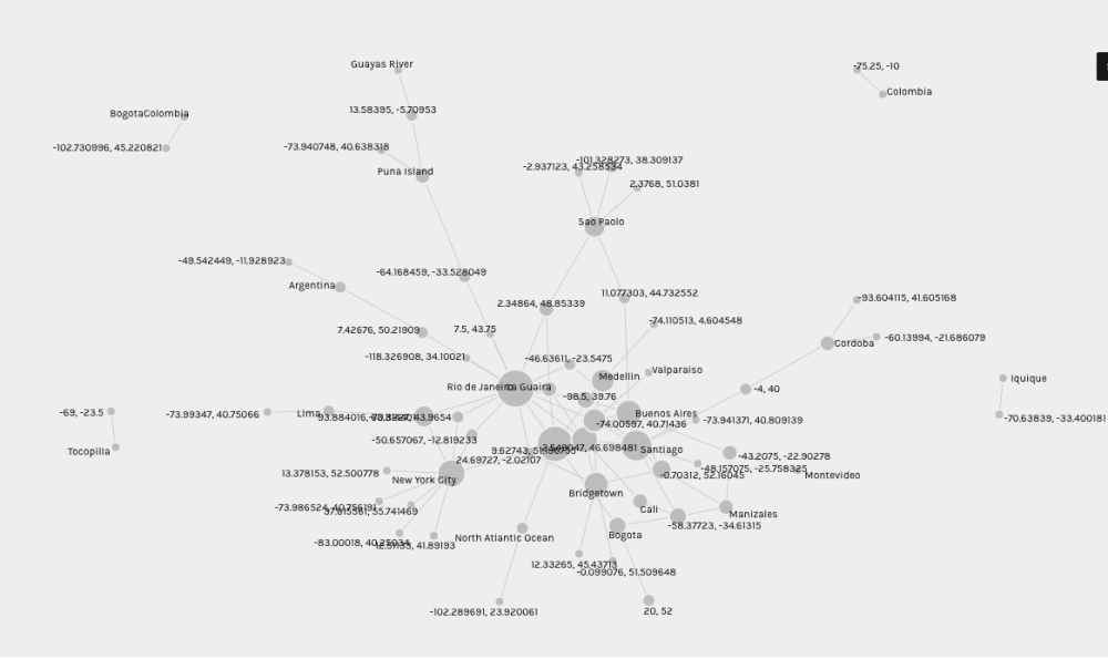
With these maps, I take a break from the South American route itself to look instead at where the dancers and other travelers on the 1941 tour came from. This creates a (somewhat) more distributed picture of exchange than one might imagine when looking at only those singular lines that begin and end in New York harbor.

The data comes from a series of documents collected in preparation for travel visas, which required that dancers provide proof of birthplace, birthdate, and current citizenship. For most dancers born inside the United States, the lists are relatively straightforward, except where documentation had been lost. For those born in one of seven countries outside of the United States, there is additional information and dates for immigration status (“alien registration”, “first papers”), quota numbers, and cities of application. For some reason, Balanchine’s birthplace is never specified beyond “Russia.”

In manually collating the datasets, I focused primarily on place of birth and current citizenship, which are only two of the many possible ways to mark affiliations to place. A dancer born in London was domiciled in Montreal, worked in the US under a quota visa, but traveled under a valid Canadian passport. Two dancers born in different cities in Germany required extensive documentation, since they were officially listed as “stateless.” These examples suggest how many lives exceed the chosen anchors.

To take a general overview: the travelers were born in 36 cities across 8 countries: the United States, England, Germany, Mexico, Cuba, Australia, Russia, and Canada. Between them, their birthplaces touch several continents. New York City dominates the United States cities, followed by Philadelphia. Beyond what we think of now as the northeast corridor (New Jersey, Connecticut, Massachusetts, Pennsylvania), travelers came from Illinois, Ohio, Utah, Oklahoma, Washington, North Carolina, California, and Missouri. Dancers held citizenships in four countries, plus the stateless Germans, whose passports had been invalidated.

Here is a map marking places of birth. The coloring is by country, but specific city names appear when you hover over a particular dot:

Whereas here is a map where places of birth are colored by the travelers’ citizenship as of spring 1941, when they set out on tour:

Maps like these do not take into account, for example, the travels of dancers and other tour workers between their birth and the spring of 1941. For example, while northern California is not represented, two of the dancers had come from San Francisco Ballet. Likewise, the wardrobe mistress from Russia had actually been on Ballet Russes’s South American tour, and another dancer is listed as previously performing for “Monte Carlo,” although the dates are not specified.

But there is another map that I’d like to make even more. It’s a point to point map, based not on factual data such as this, but on the “fictional” novel written on tour. (Update: I did it and it’s here.) Each time a location is mentioned, I would draw a line between the city where the novel is when the other place is mentioned, and the reference. In this way, it would be possible to build a map of interconnected places from the perspective of those on tour. There are many decisions to make with this: would it need to distinguish between external and internal referents, ie: world events versus associations in the dancers’ own minds? What counts as a concrete enough reference to use? And how might enough lines ultimately warp the basemap to create a different picture of the world landscape?

In the meantime, one last map experiment that colors birthplace by company role to think a bit more about labor:

Historical Basemaps

Up until now, I have been working with relatively generic contemporary baselayer maps. But I was interested to see how different certain older maps might be, given some of the political upheaval in South America in the past 80 years. Of course, however, I first had to get lost in the fabulousness of the historical maps themselves.

For example (and extremely apropos), in 1942 Ernest Dudley Chase published what was called the “Good Neighbor Pictorial Map of South America.” While one digital collection explains that this was meant to offer up “a positive message of solidarity between South America and the U.S.”, another indicates that it was used by the Moore-McCormick Lines. This was in fact the ocean liner company that American Ballet Caravan used between New York and Rio at the start of their tour.

http://www.davidrumsey.com/luna/servlet/detail/RUMSEY~8~1~268266~90042615:The-Good-Neighbor-Pictorial-Map-of-

Other maps were created for different uses, such as this 1942 physical-political classroom map, designed for viewing from up to 40 feet away (and used in UC Berkeley’s Department of Geography). For the moment, I have started with a Rand McNally road map from 1941.

Unfortunately none of the pre-referenced maps in the extensive David Rumsey Map Collection corresponded closely enough to locations and dates. But the collection does allow users to contribute their own georeferencing, so I started working on the road map with some clumsy correlations of my own. Mike then took the next step to develop a Mollweide projection, that he then rubbersheeted to match some prominent cities. He also wrote me out a tutorial in the process.

Screen Shot 2015-07-28 at 9.37.43 AM
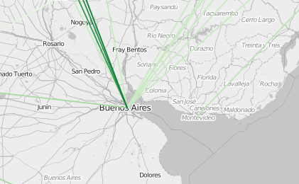
The historical maps do more than simply provide an accurate baselayer. For example, I have been wondering about some of the empty spaces on the maps that I have been creating so far. In other words, where didn’t the tour go and why? Or why choose these particular cities? I have been searching for other open datasets pertaining to South America in 1941, which might help answer such questions via population, GDP, etc. However, looking at the 1941 atlas, it is conspicuous that the most dominant lines and therefore the largest roads on the map trace out almost exactly the path taken by American Ballet Caravan (even though the company itself often traveled via other means). I’ve turned on the breadcrumbs in the cumulative animation, so that this pattern is visible.

Merging Tables and Layering Maps

In progress: a post about researching and georeferencing fabulous historical basemaps. (Really… who can resist a 1942 map entitled “The Good Neighbor Pictorial Map of South America”?) But for now: a bit of experimentation with composite maps. Before moving on to keying off of other datasets, there is more to do with putting together my own data differently.

CartoDB allows users to merge datasets and also to layer multiple datasets. This screengrab comes from a map that is not very pretty (yet), but informative nonetheless.

Screen Shot 2015-07-27 at 5.20.19 PM

This map consists of two layers. The farther-back layer is drawn from a dataset with the routes converted to GeoJSON linestrings. Here each string is labeled with the type of transportation. Right now, these are simply represented as direct lines, although in the future they could be arced, or even made to run along a suggested route (so that boats would not be, for example, running on land).

The second layer is based on several tables which have been merged inside CartoDB on the basis of “stay” identifiers. The choropleth is based on number of performances per city, from 1 to 18. I made the distribution uneven, because there is a much finer gradient of performances in the lower numbers than in the upper, and therefore the difference between 1 and 2 performances seems more significant than, say 15 and 18. The cities with null values are white with a 50% opacity (they were only passed through in transit). I’ve also added labels that appear on a hover and list the city name and number of performances for the cities in which performances occurred, although they are currently blank for transit cities.

This composite map is useful in how it begins to pull the pieces together. Montevideo, for example, suddenly appears very important as the only location not “on the way” — compare this with the one-night stands in Vina del Mar near the water, or Manizales along the rail journey. The addition of certain transit (non-performance) cities also begins to flesh out a more circuitous journey, such as the transition in Callao from boat to train between Valparaiso and Lima.

Getting an Outside Eye

Yesterday, I met with Mike Migurski to look over some of the datasets and maps that I’ve been setting up. A few key takeaways from the conversation:

  • There is a project from last November, which was doing something very similar in circling around the same datasets in different ways to see what insights turn up: Paul Downey’s One CSV, Thirty Stories (he only actually makes it to 21, but still fascinating).
  • How to key off of other datasets (for example with a GeoNames id), but also the complications of this for historical work, where borders, roads, population, etc will have been different. Another interesting collision might be to explicitly follow this historical thread and run up against a WWII dataset.
  • Restructuring my database. While I’ve been working with two primary tables (“shows” and “routes”), Mike suggested adding a third for “stays,” so that each has a unique identifier, for example if dancers pass through a town more than once. We also discussed the difference between entering a value, for example in a “transportation” column, versus having five columns, one for each possible type of transportation, into which one selects only y/n.
  • How to deal with ambiguity. I’ve been struggling with knowing when dancers are in a given place in order to perform, but not how long they traveled to get there versus how much in advance of a given performance they arrived to rehearse (other archival evidence suggests this was not consistent — sometimes they even performed the night they arrived). We talked about dealing with these stays and trips by keeping track of four dates for each: i) earliest possible begin; ii) latest possible begin; iii) earliest possible end; iv) latest possible end. This is appealing to me, because it has the potential to highlight the offstage time, which is harder to track than the performances.

Animating Performances on Tour with CartoDB

I have other visualization ideas to try, but first I wanted to look at one of the same ABC performance datasets from before in CartoDB. Even though the underlying data is the same, each platform has its own quirks that require reformatting the database through trial and error. Upload, stare, delete, edit, upload…

Whereas Palladio is not made for easy sharing, all datasets uploaded to CartoDB are public by default. Sharing work that is still in progress might be nervewracking for a historian. But this open data means it is very easy to share animated maps that are hosted directly on CartoDB’s site, for example by embedded them directly into other webpages. (Note: to see any of the maps embedded here larger/cleaner on CartoDB’s site, you need to click the paper airplane icon in the top right corner, followed by “link to this map.”)

Like Palladio, CartoDB is also an evolving system. Last time I explored, they made it very easy to customize the CSS file, but there were a limited number of “out of the box” options. Since then, more have been added. One of the more straightforward settings is to animate chronologically a heat map of number of performance days per location (note: not performances), which can be set cumulatively as well, so that it leaves a trail across the map.

Another possibility with CartoDB is to set up a poster-style map that plots cities based on density of a particular dataset column. With this color scale, it is very easy to see at quick glance the proportion of performance dates per location across the continent.

CartoDensity

These maps can also be modified by other parameters as well. For example, in the database, I categorize the shows into three buckets: “matinee,” “evening,” and “[evening].” The last refers to a show that is likely evening but only listed in the budget documents as under a sub-type, ie: “subscription” or “benefit.” Here is an example of a map where animation is essential, because multiple performances often occurred at different times of day in the same place. I’ve set the duration to be slower, so that there is time to see the color changes. However, the visibility of particular shows depend on a change in time of day.

Other notes so far on new additions to this version of CartoDB:

  • It is much easier now to set click or hover-based information pop-ups, which used to have to be entered in CSS form.
  • Although I haven’t done much with them, there are many more wysiwyg tools than before for annotation, titles, etc.
  • Once you get used to it, the forking of one dataset to many possible maps is useful.
  • The timebar in the lower left does not have the same visual appeal of CartoDB’s other features. I need to look into custom mods people have done.
  • Any kind of point-to-point map still requires custom code. Next time!